Archive
Re-Blog: Volatility and Position Size
This is one of my favorites, and every few years I re-blog some portion of this article. The original, I wrote in 2010. The basic question is, what is the correct way to respond as an investor to increasing uncertainty? In the original blog and in various re-posting edits, I’ve applied a basic idea called the “Kelly Criterion” to explain why responding to market selloffs by trimming a position, rather than adding to it, is often the right strategy (in the sense of it being mathematically optimal, not in the sense of it always producing the best returns). The idea also applies to the question of what to do when the general level of uncertainty and volatility rises (or falls) in markets. With developing uncertainty in the Middle East and the US spiraling towards what looks to be a summer of crazy politics, it is rational – even optimal – to ‘take some chips off the table.’ Read on for why.
(“Kicking Tails” originally appeared February 12, 2018)
Like many people, I find that poker strategy is a good analogy for risk-taking in investing. Poker strategy isn’t as much about what cards you are dealt as it is about how you play the cards you are dealt. As it is with markets, you can’t control the flop – but you can still correctly play the cards that are out there.[1] Now, in poker we sometimes discover that someone at the table has amassed a large pile of chips by just being lucky and not because they actually understand poker strategy. Those are good people to play against, because luck is fickle. The people who started trading stocks in the last nine years, and have amassed a pile of chips by simply buying every dip, are these people.
All of this is prologue to the observation I have made from time to time about the optimal sizing of investment ‘bets’ under conditions of uncertainty. I wrote a column about this back in 2010 (here I link to the abbreviated re-blog of that column) called “Tales of Tails,” which talks about the Kelly Criterion and the sizing of optimal bets given the current “edge” and “odds” faced by the bettor. I like the column and look back at it myself with some regularity, but here is the two-sentence summary: lower prices imply putting more chips on the table, while higher volatility implies taking chips off of the table. In most cases, the lower edge implied by higher volatility outweighs the better odds from lower prices, which means that it isn’t cowardly to scale back bets on a pullback but correct to do so.
When you hear about trading desks having to cut back bets because the risk control officers are taking into account the higher VAR, they are doing half of this. They’re not really taking into account the better odds associated with lower prices, but they do understand that higher volatility implies that bets should be smaller.
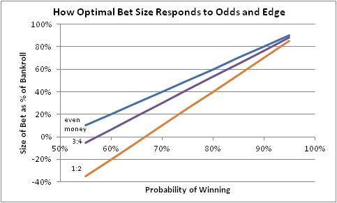
In the current circumstance, the question merely boils down to this. How much have your odds improved with the recent 10% decline in equity prices? Probably, only a little bit. In the chart below, which is a copy of the chart in the article linked to above, you are moving in the direction from brown-to-purple-to-blue, but not very far. But the probability of winning is moving left.
Note that in this picture, a Kelly bet that is less than zero implies taking the other side of the bet, or eschewing a bet if that isn’t possible. If you think the chance that the market will go up (edge) is less than 50-50 you need better payoffs on a rally than on a selloff (odds). If not, then you’ll want to be short. (In the context of recent sports bets: prior to the game, the Patriots were given a better chance of winning so to take the Eagles at a negative edge, you needed solid odds in your favor).
Now if, on the other hand, you think the market selloff has taken us to “good support levels” so that there is little downside risk – and you think you can get out if the market breaks those support levels – and much more upside risk, then you are getting good odds and a positive edge and probably want to bet aggressively. But that is to some extent ignoring the message of higher implied volatility, which says that a much wider range of outcomes is possible (and higher implied volatility moves the delta of an in-the-money option closer to 0.5).
This is why sizing bets well in the first place, and adjusting position sizes quickly with changes in market conditions, is very important. Prior to the selloff, the market’s level suggested quite poor odds such that even the low volatility permitted limited bets – probably a lot more limited than many investors had in place, after many years of seeing bad bets pay off.
[1] I suspect that Bridge might be as good an analogy, or even better, but I don’t know how to play Bridge. Someday I should learn.
When to Own Breakeven Inflation
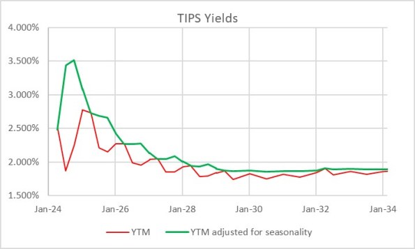
It is interesting to me that, with as important and liquid as the inflation-linked bond market is, tactical allocation between TIPS and nominal bonds is at best an afterthought for most investors. Perhaps this is because TIPS – if you think in nominal space, like most investors do – can be quirky and complex to analyze on a bond-by-bond basis. Here’s a picture of the TIPS yield curve. The red line is the way that TIPS real yields are calculated, and therefore the curve as perceived in the market. The green line is the true yield curve, adjusting for the way the seasonality of inflation prints affects each particular bond.
That’s understandable, but I don’t think it’s sufficient. Most investors do not invest in individual bonds, especially in TIPS space. They invest via mutual funds or ETFs, although the ‘laddering’ of TIPS to form a crude inflation-linked annuity is a popular approach amongst do-it-yourselfers. So why do so many investors own nominal bonds, instead of inflation-linked bonds, as an immutable strategic allocation? Even those who make occasional tactical shifts into TIPS seem to do so when they are expecting inflation to rise, and so are making a macro call instead of a quantitative call. But there are lots of times when owning TIPS instead of nominal bonds is just a good bet, regardless of your immediate inflation view. The most obvious one I wrote about back in March 2020 in “The Big Bet of 10-year Breakevens at 0.94%,” and I’ve also written generally about why you might want to be long inflation-linked bonds even if the current level of implied inflation (aka ‘breakevens’) is near to fair on the basis of your own view about the trajectory of inflation (see “A Guess at the Value of Long Inflation Tails” as an example).
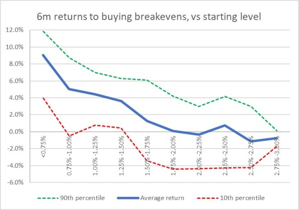
But the times when just being long TIPS instead of nominals…or being long breakevens or inflation swaps if you do it as a leveraged play…is advantageous are not limited to unusual circumstances. TIPS also have tended to be systematically cheap over long periods of time, which I’ve also documented. Another way to consider the same question is to ask, “if I bought 10-year breakevens when they were at a particular level, how would I have done historically?” Or, equivalently, “if I had switched into 10y TIPS, instead of 10y Treasuries, when the spread was at a particular level, how much would I have out- or under-performed historically?” The chart below answers that question.
I went back to February 1998. For each of 6,453 days (ending in June 2023 since I had to look forward 6 months) I considered the starting 10-year breakeven rate and calculated the return to being long that breakeven over the next 6 months.[1] That return is dependent on the relative yields of the different securities, how those yields (and hence the breakeven) changed over time, and how actual inflation developed. It’s worth pointing out that this time period, core inflation was below 3% for 90% of the time. Ergo, you wouldn’t expect to have lots of big wins because of inflation surprise, although of course toward the end of the historical period you did.
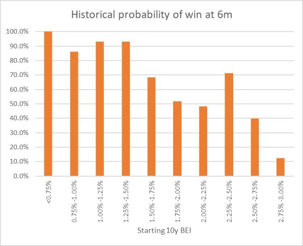
The chart shows for each bin (I threw all 58 days with 10-year breakevens lower than 0.75% into the same bucket, which turned out to be equal to the number of days in the 2.75%-3.00% bucket) what the average 6-month return was to being long 10-year breakevens along with the 10th percentile and 90th percentile. So you can see that on average, you didn’t lose money being long breakevens anywhere under 2.50%, despite the fact that inflation throughout this period was very low. That’s a function of what I said before, that TIPS in general were cheap throughout this period. And if you bought breakevens (or switched into TIPS) any time that the breakeven was below 1.5%, you had a 90% or better chance of winning.
Naturally, it shouldn’t be a surprise that if you buy breakevens at a cheap level – as with any asset – you stand a better chance of winning than if you bought it at a dear level. What is a little more of a surprise is that there hasn’t historically been very much pain, on average, to being long breakevens even when they are high. In fact, unless you bought breakevens above 2.75% – basically, one event in 2022 – you had at least a 40% chance of winning your bet (10y TIPS outperforming).
This isn’t to say that there aren’t a lot of ways to lose, trading or investing in TIPS. Like any other investment, they can lose money and in 2022-2023 being naked long TIPS was almost as painful as being naked long any other fixed-income instrument. Almost. You did lots better than if you’d owned nominal Treasuries through the same episode!
[1] I used the Bloomberg US 10 year Breakeven Inflation Index, which is a total return index (BXIIUB10 Index on Bloomberg), from its inception in 2006; prior to that I used Enduring Investments calculations which utilized roughly the same methodology.
2024 Balance of Risks
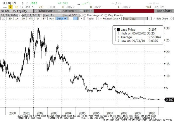
I am a risk manager, both literally and figuratively. Literally, since whether it is with our own funds and strategies or allocations for individual investor clients, or with my trading book back when I worked on Wall Street, the hard constraints are always capital, capital, and capital and so managing risk is part of how you make sure you don’t lose that capital. But also figuratively – my natural disposition is conservative, which is why I am a bond guy (concerned with getting my original investment back at par, at the end) rather than an equity guy (filled with dreams of a 10-bagger because I’m the first guy to figure out that Blockbuster Video is going to revolutionize video rental, and not so worried about how it will vanish almost overnight to Netflix).
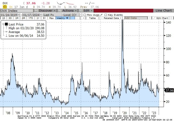
So when I look at the investing landscape, I’m generally not focusing very much on ‘what I think is going to happen’; rather I spend more time thinking about the range of possible things that might happen, and their relative likelihoods. In theory, all rational investors do this but the markets do not trade like it. For example, currently Crude Oil trading at $72.60 does not seem to put any weight on the possibility of a hot war in the Middle East that could abruptly spike prices to $125/bbl or more. That’s not a prediction there will be a conflict that disrupts oil production or distribution (which, since there’s already a conflict – even though it hasn’t impacted oil production and only marginally impacted distribution – doesn’t seem like the sort of tiny-risk possibility we can ignore), but merely an observation. If you think there’s even a 10% chance that oil spikes $50/bbl, it would be worth $5/bbl. “But Mike,” you say, “maybe that’s already in the price and but for that possibility oil would be $5 lower?” Well, the risk manager in me looks for confirmation that the market is at least a little nervous, and with the Oil VIX trading at its long-term average and well below the average of the post-2020 spike it strikes me as hard to characterize the energy markets as ‘nervous.’
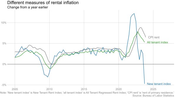
Anyway, this is why I dislike year-end ‘outlook’ pieces and why when I forecast CPI for a year or two out I almost always focus on a range of probable outcomes rather than a point estimate.[1] Honestly we should all do this, but not enough people have studied enough statistics to understand the significance of the error bars. If you have an experimental mean, and a nice large error bar, it signifies that you can’t reject the possibility that the true mean is anywhere in the range covered by the error bar. And that’s why, when someone introduces a new rent index that supposedly is more current but by their own admission has 15 times the standard error…I ignore it.
Enough of the preliminaries. Let me get on with this. Here are my thoughts about the balance of risks for just a few important items:
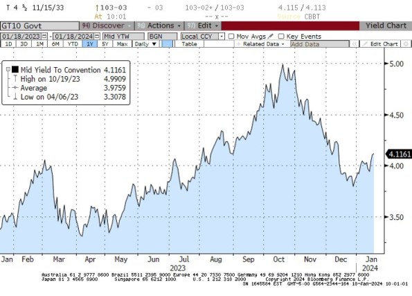
Interest rates: balance of risks is clearly higher. This was even more true at the end of the year. But with 10-year rates at 4.11%, down from 5% in October, keep in mind that two ways to get lower interest rates are already priced in: the short end of the curve reflects expectations (despite Fed officials’ protestations to the contrary) of roughly 150bps of cuts in the overnight policy rate this year, and the long end reflects inflation expectations of only 2.27% inflation over the next 5 years and only 2.30% inflation over the next decade. On top of this, consider that with the trade deficit declining but the budget deficit not declining, more of the budget deficit will have to be funded from domestic saving – and the Fed is still shrinking its balance sheet, so it is pushing in the opposite direction. The balance of risks in the bond market is to higher rates.
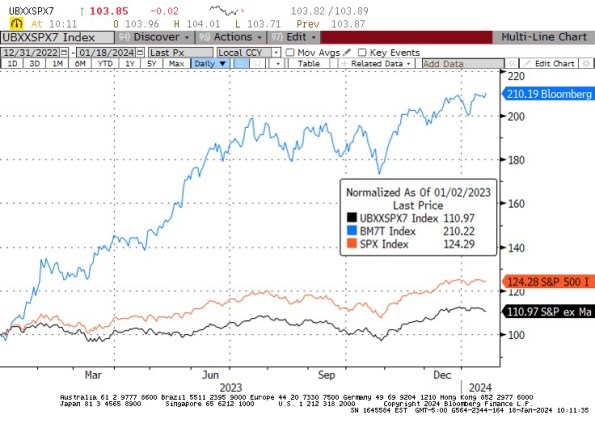
Stock market: balance of risks is lower, with the caveat that the picture is much better if looking at the market ex-the ‘Magnificent 7’ hot stocks (Apple, Nvidia, Meta, Tesla, Amazon, Microsoft, and Google). The S&P currently has a P/E of 21.4 and is up 24% since the end of 2022. The S&P ex-Mag7 has a P/E of 18.4 and is up 11% since the end of 2022. The Magnificent 7 themselves have a P/E of 39.5 and are up 110% over the last year.
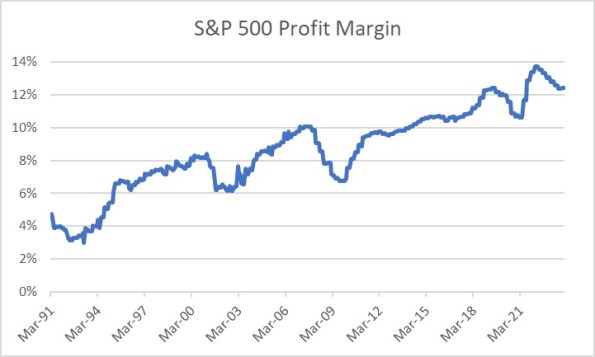
The overall market P/E looks not-too-bad, until you remember that this is only because profit margins are currently only just a bit below at least 30-year highs (and probably lots longer – this is as far back as Bloomberg has trailing-12-months margins). The balance of risks is definitely for lower margins, which means lower earnings, which means the same equity prices would represent higher P/Es. Oh, and whatever happened to those people saying that the high equity prices were due to the really low interest rates? Haven’t heard from them in a while.
Where I have clients who are long equities, they’re long equal-weight indices so as to lessen exposure to the Magnificent 7. But even if those stocks were the only ones overvalued, it’s not reasonable to think that they can come back to earth and not bring down the rest of the market. If Apple, Nvidia, Meta, and Microsoft drop 30%, the rest of the market isn’t going to go up. However, if such a thing were to happen the market outside of the Mag 7 could feasibly eventually get to looking cheap.
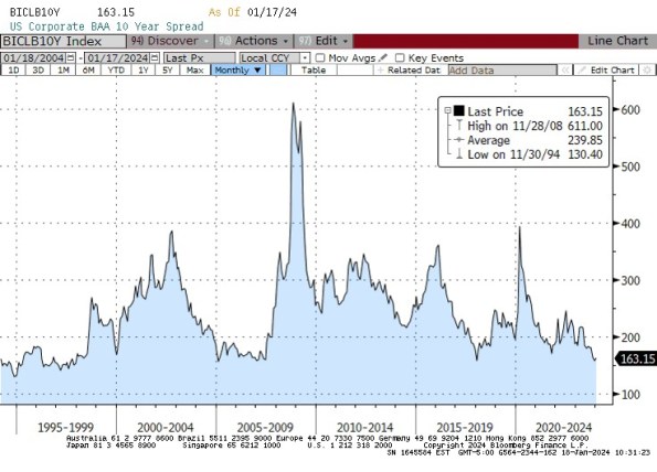
Credit spreads: balance of risks is wider, with the 10-year Baa credit spread near 30-year lows. Really, how low does this go? And the tails are obviously one-way.
So I’ve said the balance of risks favor higher interest rates, wider credit spreads, lower corporate margins, and lower equity prices. It’s also useful to think about where the risks are in my risk assessments. If we get lower interest rates, instead of higher, then it’s very likely due to the economy being a lot weaker than it currently is, and the Fed ends up having to ease more than 150bps in 2024. That seems unlikely to me, but if it happens then notice that probably also means that credit spreads will widen and corporate margins, earnings, and stock prices decline. So, if you’re bullish on bonds and stocks, it seems to me you’re taking a dangerously narrow path. The balance of risks to me look bearish on both sides of that, but the bullish outcome for bonds implies (I think) a bearish outcome for stocks. It’s difficult for me to see an environment with appreciably higher stocks and bonds, unless the Fed eases aggressively without any economic weakness. So that’s your implied bet.
On the other hand, being bearish both stocks and bonds doesn’t carry such a narrow path risk. Unless the Fed eases despite a solid economy, It isn’t hard to envision an environment with lower stocks and bonds. Heck, we had just such an environment a few months ago, pre-‘pivot.’ It’s not a reach.
None of the preceding is a forecast. But investing and trading are about evaluating the range of risks, and trying to take positions with asymmetric risk-adjusted payoffs. In my opinion, long-only investors should be playing short on the yield curve (and going up credit, and inflation-linked rather than nominal) and anti- cap-weighting their stock holdings.
That’s as close to an outlook piece as I am doing this year. Have fun.
[1] In the last few years, I’ve started putting a point estimate for CPI in my Quarterly Inflation Outlook, but I also report what I see as the 1 standard deviation range so I can indicate the skewness of the risks in my view.
How Higher Rates Cause Big Changes in the Bond Contract
Two weeks ago I pointed out one of the effects of higher interest rates is that leveraged return strategies get swiftly worse as rates rise. Today, I want to talk about another result of higher interest rates which is, to me, much more fun and exciting. It involves the Treasury Bond cash-futures basis.
I know, that doesn’t sound so interesting. For many years, it hasn’t been. But lately, it has gotten really, really interesting – and institutional fixed-income investors and hedgers need to know that one of the major effects of higher interest rates is that it makes the bond contract negatively convex, not to mention that right now the bond contract also looks wildly expensive.
Some background is required. The CBOT bond futures contract (and the other bond contracts such as the Ultra, the (10y) Note, the 5y, and the 2y) calls for the physical delivery of actual Treasury securities, rather than cash settlement. Right now, thanks to ‘robust’ Treasury issuance patterns, there are an amazing 54 securities that are deliverable against the December bond futures contract. The futures contract short may deliver any of these bonds to satisfy his obligations under the contract, and may do so any time within the delivery month.
Now, if we just said the short can deliver any bond, the short would obviously choose the lowest-priced bond. The lowest-coupon bond is almost always going to be the lowest-priced; right now, the 1.125%-8/15/2040 sports a dollar price of 55.5.[1] But if we already know what bond is going to be deliverable, and it’s always the optimal bond to deliver, then the futures contract is just a forward contract on that bond, and it becomes very uninteresting (not to mention that liquidity of that one bond will determine the liquidity of the contract). So, when the contract was developed the CBOT determined that when the bond is delivered it will be priced, relative to the contract’s price, according to a conversion factor that is meant to put all of the bonds on more or less similar footing.[2] The price that the contract short gets paid when he delivers that particular bond is determined by the futures price, the factor, and the accrued interest on the delivery date…and not the price of the bond in the market.
Because the conversion factor is fixed, but the bonds all have different durations, which bond is cheapest-to-deliver (“CTD”) changes as interest rates change. When interest rates fall, short-duration bonds rise in price more slowly than long-duration bonds and so they get relatively cheaper and tend to become CTD. When interest rates rise, long-duration bonds fall in price more quickly than short-duration bonds and so tend to become CTD in that circumstance. And here’s the rub: when interest rates were well below the 6% “contract rate”, the CTD bond got locked at the shortest-duration deliverable, which also usually happened to be the shortest-maturity deliverable, because that bond got cheaper and cheaper and cheaper as the market rose and rose and rose. The consequence is that the bond contract, as mentioned earlier, eventually did become just a forward contract on the CTD (and a short-duration CTD at that), which meant that the volatility of the futures contract was lower, the implied volatility of futures options was lower, and the price of the futures contract was uninteresting to arbitrageurs because it was very obviously the forward price of the CTD. And this situation persisted for decades. The last time the bond and 10-year note yielded as much as 6% (which is where all of the excitement is maximized, since after all the conversion factor is designed to make them all more or less interchangeable at that level) was 2000. [Coincidentally or not, that was right about the time I stopped being exclusively a fixed-income relative value strategist/salesman and started trading options, and then inflation.]
So, now the long bond yields 4.96% and the deliverable bonds in the December bond contract basket have yields between 5.03% and 5.22%. This starts to get interesting. As of today, the CTD bond is the 4.75%-Feb 15, 2041. If you buy that bond and sell the contract,[3] then the worst possible case for you is that you deliver that bond into the contract and lose roughly 12/32nds after carry.
However.
Because you are short the futures contract, you can deliver whatever bond is most-advantageous to you at the time you elect to deliver. If any other bond is cheaper than the 4.75s-Feb41, then you buy that bond, sell the Feb41s, and deliver. And obviously, that’s a gain to you. And you can make that switch as often as you like, up until delivery.
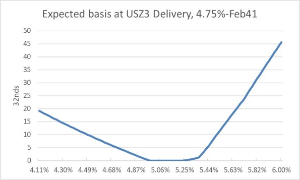
Can you predict approximately when the bonds will switch? Sure, because we know the bonds’ durations we can estimate the CTD – and the value of switching – for normal yield curve shifts. While the steepening and flattening of the deliverable curve also matter, remember that anything that adds volatility to the potential switch point adds value to you, the futures short. Here is, roughly, the expected basis at delivery of that Feb41 bond.
Now isn’t this interesting? If the bond market rallies, then we know that shorter-duration bonds will become CTD, pushing the Feb 41s out. And if the bond market sells off, then we know that longer-duration bonds will replace the Feb 41s as CTD. Notice that this looks something like an options strangle? That’s because it essentially is. You own a strangle, and you’re paying 12/32nds for that strangle. (Spoiler alert: you can sell a comparable options position in the market for roughly 28/32nds, making the basis of that bond about half a point cheap, or equivalently the futures are about half a point rich.
Okay – if you’re not a fixed-income relative value strategist…and let’s face it, they’re a dying breed…then why do you care?
If you’re a plain old bond portfolio manager, you may use futures as a hedge for your position; you might use futures to get long bonds quickly without having to buy actual bonds, or because you aren’t allowed to repo your physical bonds but you can get some of the same benefits by buying the futures contract. You might buy options on futures to get convexity on your position, or to hedge the negative convexity in your mortgage portfolio.
Well guess what! None of that stuff works the same way it did 15 months ago!
Because longer-duration bonds are CTD now, the contract has more volatility. Which means the options on those futures have more implied volatility. Also, the bond contract is no longer guaranteed to be within a tick of fair value because the CTD is locked. When I worked for JP Morgan’s futures group, we thought if the futures contract got 6 ticks rich or cheap it was exciting. Well, we’re looking at a futures contract that’s a half-point mispriced![4]
Finally – as I said, the bond contract now has negative convexity, which means that when you are long the contract you will underperform in a rally and underperform in a selloff (while earning the net basis of 12 ticks, in a best case). Because when you own the bond contract you have the opposite position I’ve illustrated above: you’re short a strangle. If you’re long the contract then as the market sells off the bond contract will go down faster and faster as it tracks longer and longer duration deliverables. And if the market rallies, the contract will rise slower and slower as it tracks shorter duration deliverables. The implication is that especially because the bond contract is rich, it is great as a hedge for long cash positions at the moment, and a pretty bad hedge for short positions. And it’s great to hedge long mortgage positions, since when you sell the contract you also pick up some convexity rather than adding to your short-convexity position.
This all sounds, I’m sure, very “inside baseball.” And it is, because most of the people who used to trade this stuff and understood it are retired, have moved to corner offices, or are old inflation guys who just wonder why we don’t have a deliverable TIPS contract. But just as with my article two weeks ago, it’s something that I think it important to point out. We’re so obsessed with the ‘macro’ implications of higher rates, we stand to miss some of the really important implications on the ‘micro’ side of things!
[1] I’m using decimals to make this more accessible to non-bond folks, but we all know that this really means 55-16.
[2] The conversion factor is the answer to the question, “what would the price of this bond be if, on the first day of the delivery month, it were to yield exactly 6% to maturity”? So the aforementioned 1-1/8 of Aug-40s have a conversion factor into the December contract of 0.4938 while the 3-7/8 of Aug-40 has a conversion factor of 0.7794.
[3] I am abstracting here from the more technical nuances of how one weights a bond basis trade, again for brevity and accessibility.
[4] There’s a big caveat here in that the yield curve dynamics in my model for the shape of the deliverable bond yield curve are out-of-date, as I haven’t used this model in years…so the contract might be anywhere from 10 ticks to 20 ticks rich. But it’s rich!
We Are All Bond Traders Now
When I started working in the financial markets, bond traders were the cool kids. The equity guys drove Maseratis and acted like buffoons, but the bond guys drove sensible style like Mercedes and cared about things like deficits and credit. The authoritative word on this subject came from the book Liar’s Poker by Michael Lewis, about 1980s Salomon Brothers, where the trainees dreaded being assigned to do Equities in Dallas.
Back then, equities guys worried about earnings, the quality of management and the balance sheet, and the really boring ones worried about a margin of safety and investing at the right price. That seems Victorian now, but I guess so does the idea that sober institutions should only own bonds.
Down the list of concerns, but still on it, were interest rates. Ol’ Marty Zweig used to have a commercial in which he said “if you can spot meaningful changes (not just zig-zags) in interest rates and momentum, you’ll be mostly in stocks during major advances and out during major declines.” The reason that interest rates matter at all to a stock jockey is that the present value of any series of cash flows, such as dividends, depends on the interest rate used to discount those cash flows.
In general, if the discount curve (yield curve) is flat, then the present value of a series of cash flows is the sum of the present values of each cash flow:
…where r is the interest rate.
As a special case, if all of the cash flows are equal and go on forever, then we have a perpetuity where PV = CF/r. Note also that if all of the cash flows have the same real value and are only adjusted for inflation, and the denominator is a real interest rate, then you get the same answer to the perpetuity problem.[1]
I should say right now that the point of this article is not to go into the derivation of the Gordon Growth Model, or argue about how you should price something where the growth rate is above the discount rate, or how you treat negative rates in a way that doesn’t make one’s head explode. The point of this article is merely to demonstrate how the sensitivity of that present value to the numerator and the denominator changes when interest rates change.
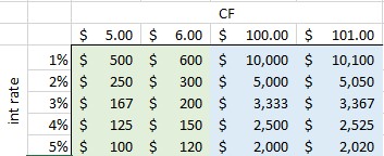
The sensitivity to the numerator is easy. PV is linear with respect to CF. That is, if the cash flow increases $1 per period, then the present value of the whole series increases the same amount regardless of whether we are increasing from $2 to $3 or $200 to $201. In the table below, the left two columns represent the value of a $5 perpetuity versus a $6 perpetuity at various interest rates; the right two columns represents the value of a $101 perpetuity versus a $102 perpetuity. You can see that in each case, the value of the perpetuity increases the same amount going left to right in the green columns as it does going left to right in the blue columns. For example, if the interest rate is 5%, then an increase in $1 increases the total value by $20 whether it’s from $5 to $6 or $100 to $101.
However, the effect of the same-sized movement in the denominator is very different. We call this sensitivity to interest rates duration, and in one of its forms that sensitivity is defined as the change in the price for a 1% change in the yield.[2] Moving from 1% to 2% cuts the value of the annuity (in every case) by 50%, but moving from 4% to 5% cuts the value by only 20%.
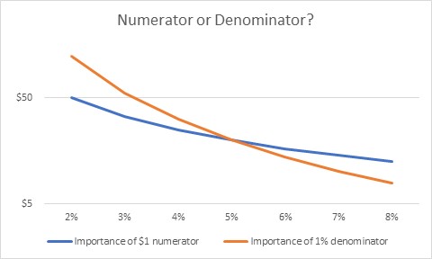
What this means is that if interest rates are low, you care a great deal about the interest rate. Any change to your numerator is easily wiped out by a small change in the interest rate you are discounting at. But when interest rates are higher, this is less important and you can focus more on the numerator. Of course, in this case we are assuming the numerator does not change, but suppose it does? The importance of a change in the numerator depends not on the numerator, but on the denominator. And for a given numerator, any change in the denominator gets more important at low rates.
So, where am I going with this?
Let’s think about the stock market. For many years now, the stock market has acted as if what the Fed does is far more important than what the businesses themselves do. And you know what? Investors were probably being rational by doing so. At low interest rates, the change in the discount rate was far more important – especially for companies that don’t pay dividends, so they’re valued on some future harvest far in the future – than changes in company fortunes.
However, as interest rates rise this becomes less true. As interest rates rise, investors should start to care more and more about company developments. I don’t know that there is any magic about the 5% crossover that I have in that chart (the y-axis, by the way, is logarithmic because otherwise the orange line gets vertical as we get to the left edge!). But it suggests to me that stock-picking when interest rates are low is probably pointless, while stock-picking when interest rates are higher is probably fairly valuable. What does an earnings miss mean when interest rates are at zero? Much less than missing on the Fed call. But at 5%, the earnings miss is a big deal.
Perhaps this article, then, is mistitled. It isn’t that we are all bond traders now. It’s that, until recently, we all were bond traders…but this is less and less true.
And it is more and more true that forecasts of weak earnings growth for this year and next – are much more important than the same forecasts would have been, two years ago.
But the bond traders are still the cool kids.
[1] I should also note that r > 0, which is something we never had to say in the past. In nominal space, anyway, it would be an absurdity to have a perpetually negative interest rate, implying that future cash flows are worth more and more…and the perpetuity has infinite value.
[2] Purists will note that the duration at 2% is neither the change in value from 1% to 2% nor from 2% to 3%, but rather the instantaneous change at 2%, scaled by 100bps. But again, I’m not trying to get to fine bond math here and just trying to make a bigger point.
2022 Year-End Thoughts About 2023
Use: This article may only be reposted in its unedited entirety (including all links), including the title and author with linkbacks to the original. If you wish to repost in serial form, please contact me via the form at https://enduringinvestments.com to discuss.
When I was a Street strategist, and/or producing ‘sales and trading commentary’ as a trader, it was de rigueur to produce an annual outlook piece. Naturally, everyone does one of those; consequently, I stopped doing them. It seems to me like it would get lost in the shuffle (this is one of the reasons that Enduring’s “Quarterly Inflation Outlook,” which we distribute to customers and is also available by subscription here, is produced on the ‘refunding schedule’ of February, May, August, and November rather than at quarter-end). Having said that – it does seem that, given what inflation has done recently, there are more people asking for my outlook.
I do have to raise one point of order before I begin. As regular readers of this column know, in my writing, I generally try to propose the ‘right questions,’ and I don’t claim to have all the right answers. An outlook piece is often interpreted as being the analyst’s best guess at the answers. While it is that, for me the answers I suggest here are likely to be less valuable to the reader (I do not recommend that you blindly place trades based on my outlook for where markets will go!) than the thought process that is going into them. You may and probably will disagree with some of my answers. But hopefully, you’ll be able to identify where in my reasoning you have specific disagreements, which will either enhance your own view or cause you to thoughtfully reconsider it. That’s the whole point, and I don’t care at all if you disagree! That’s what makes markets.
Moreover…even if my guesses end up being “wrong,” or “right,” based on the actual outcomes in the future, that doesn’t mean they were wrong or right in terms of being a good approach/positioning. Investing is not really all about making the “right” bet in terms of whether you can call the next card off the deck, but about making the “right” bet with respect to the odds offered by the game, and betting the right amount given the odds and the edge. On this topic, I recommend “Thinking in Bets” by Annie Duke as excellent reading.
So, here goes.
MACROECONOMICS
For most of this year, I have been saying that we would get a recession by early 2023. In 2022Q1 and Q2, US GDP contracted. This produced the predictable shrill announcements of recession, coupled this year with sadly simple-minded declarations that the Biden Administration had “changed the definition of recession” by saying we weren’t in one. One television commentator I saw strongly profess the view that the two-quarters-of-negative-growth-is-a-recession definition is “in every economic textbook.” Having read my fair share of economic textbooks and having taught or tutored from a few, I can assure you that is not the case.
I was, and remain, sympathetic to the incoming fire that the Biden Administration took then, because they were basically right: whether we chose to call it a ‘recession’ or not, there was scant sign of any economic distress. Employment (which lags, of course) remained strong, corporate earnings were solid, confidence was reasonably high except for inflation, and citizens still had a substantial cash hoard left over from the COVID stimmy checks. However, while the critics were wrong on the timing they weren’t wrong about the eventuality of a recession. As I also said a bunch of times, there has never been a period where energy prices rose as rapidly as they did between early 2021 and mid-2022, combined with interest rates increasing as rapidly as they did thanks to Federal Reserve policy, that did not end in recession. But it takes Wile E. Coyote some time to figure out that there is nothing under his feet, before he falls, and recessions work similarly. We will have a recession in 2023.
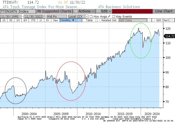
We are already seeing the early signs of this recession. One indicator I like to look at is the Truck Tonnage index, which falls significantly in every recession (see chart, source Bloomberg). The last two months have seen a decline in this seasonally-adjusted index. It is early yet – we saw a similar-sized decline in 2016, for example, so there are false signals for small changes – but the fact that this decline happened heading into the Christmas season gives it more significance.
That’s the goods side. The services side shows up more in the labor market, which lags behind the overall cycle. Yet there too we have started to see some hints of weakness. Jobless claims are well off the post-COVID lows, although they are still roughly “normal” for the tight pre-COVID labor market. And the labor market is really hard to read right now, given the continuing crosswinds from the COVID-period volatility and the fact that so many services jobs now are at least partly virtual. Upward wage pressure is continuing, partly because virtual workers are less productive (shocker reveal there), so this recession in my view will probably not feel as bad as the last couple of recessions (GFC, Covid) have felt. However, we will have a recession in 2023.
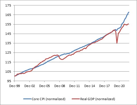
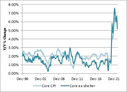
The bad news, though is that a recession does not imply that inflation, ex-energy, will decline. Look at this chart, which captures the last three recessions. The post-GFC recession was the worst in 100 years, and while core inflation slowed that was almost entirely a function of the housing market collapse and not the general level of activity. The COVID recession was worse than that, and core inflation accelerated. And the post-tech-bubble recession wasn’t a slouch either; core inflation accelerated throughout 2001 until it started to decline, but only got down to 1.1%, in late 2003.
This chart shows y/y changes, but helpfully shows core-ex-shelter (Enduring Investments calculations). There isn’t a lot to see here in terms of the effect of these three huge recessions.
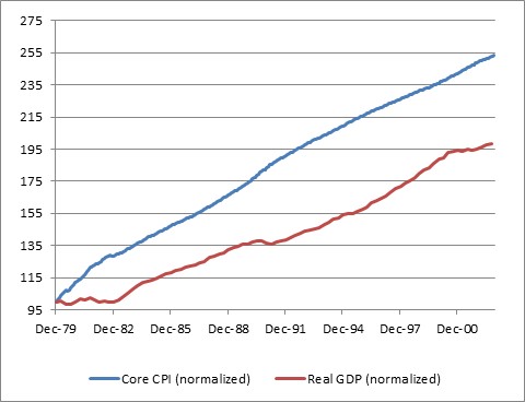
Lest you think I am just cherry-picking the 2000-2022 period, here is core CPI and GDP normalized as of December 1979. Again, you can see in the GDP line the recessions of the early 1980s, of the early 1990s, and that post-tech-bubble recession. I can’t see those, in the CPI line.[1]
And hey, as long as we are doing this…how about the 1970s malaise when the multiple recessions and flat growth led to … well, not disinflation.
I think the evidence is very clear: forecasters who are relying on the “recession” forecast (which I share) to make a “hard disinflation” forecast are simply ignoring the data. Those two concepts, outside of energy, are not related historically.
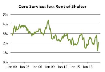
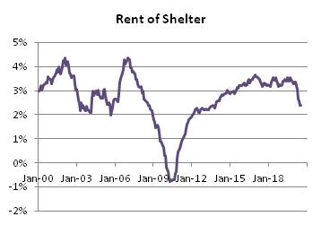
That being said, I expect core inflation and median inflation to decelerate in 2023. I just don’t think they will decelerate nearly as much as Wall Street economists think. Shelter inflation is already well above my model, and I expect will come back towards it, but my model otherwise doesn’t see a lot of downward pressure on rents yet. The strong dollar, and some healing of supply chains, will help core goods – but core goods inflation will remain positive next year and probably for a long time, thanks to secular deglobalization, instead of being in persistent slow deflation. And core services ex-rents will decelerate, but mainly because of the technical adjustment in health insurance. Until wages start to ebb, it’s hard to see a crash in core services ex-rents inflation. So that brings me to this forecast for core CPI:
| Current | 2023 Fcast | |
| Core Goods | 3.7% | 2.3% |
| Rent of Shelter | 7.2% | 4.8% |
| Core Services less ROS | 6.3% | 5.1% |
| Core CPI | 6.0% | 4.2% |
Most of the Street is in the mid-2s for core inflation; the Conference Board forecast for Core PCE recently was raised to 2.8% which would put core CPI at 3% or 3.1%. They’re getting there, but frankly it’s hard to see how you can get to those levels. In my view, most of the risks to my forecast are to the upside.
MONETARY POLICY
An important disclosure should be made here: in 2022, I was utterly wrong about the path the Fed would take. Almost as wrong as it is possible to be. Ergo, take everything I say hereafter in this section with a grain of salt.
Coming into 2022, I thought the Fed would follow the same script they had used for more than a quarter-century with respect to tightening policy: slow, late, tentative, and quickly reversed. Although inflation was already plainly not transitory, I know that the Fed’s models assume a strong homeostasis especially with inflation, to the extent that the persistent part of inflation is essentially (albeit with a lot more math) modeled as a very slow moving average and overall inflation is assumed to pull back to that level. When the Fed talks about the “underlying inflation trend,” that is in simple terms what they are saying. But if you believe that, then there’s very little reason to pursue something similar to a Taylor Rule where policy is driven by simple deviations of growth and inflation from the target levels.
So, when the Fed started to move I expected them to tighten a few times and then to stop and ultimately reverse when financial markets started doing ugly illiquid things. One thing I didn’t anticipate: the markets never really did ugly illiquid things. Investors welcomed the tighter policy, and ran ahead of the Fed to give them room. Especially considering that, at the end of 2021, I think most sophisticated investors viewed the Fed as incompetent (at best) or counterproductive (at worse), the markets gave the Committee an amazing amount of latitude. The Fed, to its credit, saw the gap in the defense and sprinted through it. I did not see that coming.
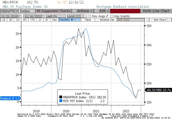
After nearly 500bps of rate hikes, and a small decline in the Fed’s balance sheet, money supply growth has come to a screeching halt. That’s largely spurious, I think, since money supply growth is a function of bank lending and banks are neither capital-constrained nor reserve-constrained at the moment, and longer-term interest rates have risen but not very much (except in the mortgage market). I suspect that most of the decrease in loan demand that is evidently happening is not in response to the increase in short-term rates but rather to the increase in mortgage rates almost entirely. If that’s the case, then it’s a one-time effect on M2 growth: mortgage origination can only go to zero once. The chart below shows the connection between M2 growth (in blue) and the MBA Purchase index (black). The correlation is not as incredible as it looks, because one is a rate of change that is off-center by 6 months (it’s y/y) and one is a level of activity, but if I expressed both in rate of change you would still say they look suspiciously similar.
If I am right about that point, then the money supply will shortly resume its growth as the overall volume of lending continues to grow without the negative offset of declining mortgage origination. With money velocity on the upswing now, this will support the level of inflation at a previously-uncomfortable level. So what will the Fed do?
Importantly, the Fed won’t really know that inflation isn’t dropping straight to 2% until after the midpoint of the year. But they’ll make the decision to pause rate hikes sooner than that. I think a 5% Fed funds rate is a reasonable target given their assumptions, a key one of which is that if “underlying inflation” is really 2%-3% then a 5% nominal rate will be plenty restrictive.
What is really amazing to me – which the ‘me’ of 2021 would never have anticipated – is that Fed watchers and market participants are starting to talk as if they believe the Fed might overdo the tightening, raising rates higher than needed to restrain the economy and inflation (yes, I know I said that a recession doesn’t cause lower inflation but it’s an article of faith at the Fed so we need to pretend as if we believe it). It’s incredible, when you think about it: the Fed hasn’t come close to ‘overdoing it’ in a tightening cycle in decades, if by ‘overdoing it’ we mean that they caused a deflationary crash. The Fed has caused plenty of recessions, but core inflation hasn’t been negative since the Great Depression. And we’re worried about them overdoing it?
Naturally, if you don’t think that raising rates causes inflation to come down then any rate hikes at all…actually, any active monetary policy at all…is too much. But in any event, it’s striking to me that the Fed has somehow restored some credibility as a hawkish central bank. Not that credibility per se matters, since expectations don’t cause inflation. But I digress. It’s still pretty amazing.
When Powell was first named Chairman, I was hopeful that a non-economist could help break the Fed out of its scholarly stupor. As time went on I lost that hope, as Powell trotted out various vacuous terms like “transitory” and leaned on discredited models (nevertheless still in vogue at the Fed) such as those which utilize the ‘anchored expectations’ hypothesis. But I have to say, my opinion of him has risen along with the Fed funds rate.
In my view, the biggest Fed error of the last forty years was Greenspan’s move to make the Fed transparent, which caused the pressures on the Fed to be entirely one-way. The second-biggest Fed error follows from that, and that is the tendency to move rates further and further away from neutral, holding rates at such a level by maintaining vastly higher levels of liquidity than were needed to run the banking system. The consequence of this has been a series of bubbles and asset markets at levels where the prospect of future real returns was abysmal. Plus, it led to the heyday of hedge funds where cheap money levered small returns into big returns.
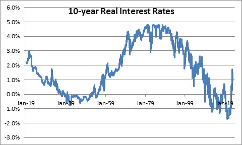
The Powell Fed, for all of its flaws and awful forecasting, has succeeded in getting the yield curve to the vicinity of long-term fair value, which I define as sovereign real rates near the long-term growth rate of the economy (2.00-2.25% in the US – see chart below, source Enduring Investments before 1997 and Bloomberg after 1997). With a Fed inflation target at 2.25% or so in CPI terms, this means long-term nominal interest rates should be in the vicinity of 4%-4.5% over the long term in the context of a responsible central bank. We’re not there, but we’re getting close.
All of which means that I think the FOMC is just about done with hiking rates for this cycle. I believe they will get to 5%, pause, and stay paused for a long time. I do not expect them to lower interest rates, even if there is a recession, unless markets or banks start to have difficulties or Unemployment gets above 6%. That might happen in late 2023, but even if it does I think the Fed will be much more measured about cutting rates than they have in previous cycles. Credit to Powell for the change in attitude.
Those pieces, the Macro and the MonPol, along with my assessment of relative valuations, inform everything else.
RATES, BREAKEVENS, AND CURVES
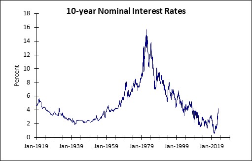
The long, long, long downtrend in interest rates is decisively finished. As noted above, when inflation is under control and in the vicinity of the Fed’s 2% target, long-term interest rates should be in the vicinity of 4-4.5%. Over the last century, when rates have been away from the 3-5% range it has generally been either because inflation was unstuck on the high side (1970s, 1980s) or unstuck on the low side (1920s, 1930s, 2010s) (see chart, source Federal Reserve and Bloomberg). The long-term downtrend can be thought of as going from unstuck-high inflation, to normal, and overshooting to the downside in the last decade. But we have now definitively ended that low-rates period.
At a current level of roughly 3.5% nominal, 1.4% real, interest rates are ‘too low’ again, but this is normal for an economy headed into recession. Ordinarily, this configuration of events – a Fed nearing the end of a tightening cycle, a recession looming, and interest rates that have risen 320bps over two years – would make me bullish on bonds. And I do think that the first part of 2023 may see a decent rally as the Fed finishes their business and the stickiness of inflation is not yet apparent, but the recession is. Seasonally, you’d really prefer to be long the bond market/out of equities in the last quarter of the year and out of the bond market/long equities in the first quarter of the year, but I think the seasonal pattern will be reversed this year. So we will come in all happy as bond investors, and get unhappy later in the year.
The reason I think the first quarter of the year will be pretty decent for bonds is because of the timing of the recession and of the end of the Fed tightening cycle. But why the selloff as the year progresses? Well, investors will start to see that inflation is not falling as fast as they had expected, the Fed is showing no signs of easing…and the Federal deficit is blowing up.
In FY 2022, the US government had a $1.38 trillion deficit,[2] in an expansion during peacetime. But there are some inexorable effects pushing that higher next year. For example, interest on the debt: higher interest rates will affect only the part of the public debt that has rolled over, but that is an awful lot of it.
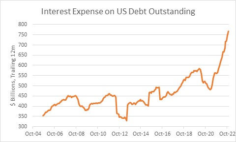
In December 2021, the rolling-12-month interest expense on US Debt Outstanding (see chart, source Bloomberg) was $584bln.[3] As of November 2022, the rolling-12-month expense was $766bln. It will be up another $100bln, at least, in 2023. Social Security benefits paid this year were roughly $1.2 trillion, and benefit payments are due to increase 8.7% next year – so, even neglecting the fact that there will be more recipients next year, Social Security should also be $100bln further in the red. That’s $200bln, on top of the approximately $1.4trillion deficit, and I haven’t even considered Medicare, the decline in tax receipts that will occur thanks to a decline in asset markets this year, or the decline in taxes on earned income when the economy enters a recession. A $2 trillion, peacetime deficit is easily in reach and will be much more if it’s a bad recession. The last time we had that big a deficit, the Fed happened to also be buying a couple trillion dollars’ worth of Treasuries. This time, though, the Fed is shrinking its balance sheet.
It is fairly easy to imagine that longer interest rates will have to rise some, in order to roll the maturing debt. As I said, higher interest rates don’t really bother me because I don’t run a highly-levered hedge fund. (But if the rise in rates were to get sloppy or rates were to rise enough to threaten a spiral in the deficit, then I can imagine the Fed stepping in to reverse its balance sheet reduction and being under even more pressure to guide rates lower. However, it’s not my base case.)
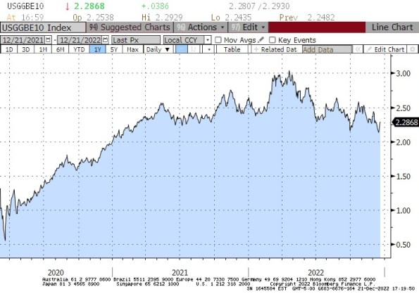
Also, as the year goes along the stickiness of inflation will become more apparent and investors will rightly start to put that assumption back into their required return for nominal bonds. One of the really crazy things that happened in 2022 was that inflation compensation in nominal bonds (aka ‘breakevens,’ the mathematical difference between yields on nominal bonds and yields on inflation-linked bonds that pay inflation on top) declined even as the overall level of inflation continued to climb. At the time of this writing, Median CPI has not yet even decisively peaked, although I think it will. But with Median CPI at 6.98%, it’s incredible that the market is demanding only 2.28% annual compensation for inflation over the next decade (see chart, source Bloomberg). That basically says investors are comfortable earning an increment that underpays them for inflation in the near term, and in the long term will only compensate them for what the Fed says they are trying to pin inflation at.
That’s not as easy a trade as it was when 10-year breakevens were at 0.94% in March 2020, but it still seems to me that most of the risk over that decade would be for inflation to miss too high, rather than too low. I understand that the FOMC wants inflation down around 2%. And as for me, I want a Maserati. Neither one of us is likely to get what he wants, just because we want it.
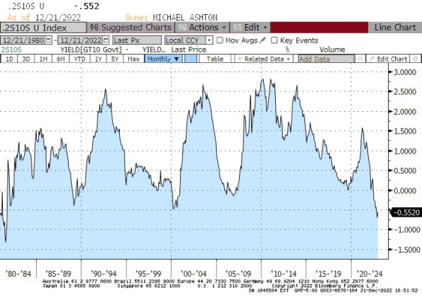
As the first quarter of the year passes and long-term interest rates decline, the curve may invert further from its current level. But I don’t think it can invert that much, which limits the value to being long, say, 10-year notes from this level. Given the current level of inversion, it is fairly easy to construct steepener trades that throw off positive carry. For that matter, a leveraged investor who is financing at 4.5% and earning 3.75% is more likely to want to go the other way! I think it’s going to be difficult to get a good bull market rally going in bonds, and if I was a leveraged hedge fund investor I’d be playing from the short side/steepener side even in the first quarter of the year (albeit cautiously). The chart below (source: Bloomberg) shows 2s/10s monthly going back to 1980. The only time the curve was more inverted was in the early 1980s, a couple of years after Volcker’s Saturday Night Special and with the hiking campaign solidly underway as it is now. I’m expecting 2s/10s to go positive in 2023, although the best shot at something like +50bps would come if the Fed actually did ease. Ergo, a steepening trade is also nice because it works in my favor more if I’m wrong about the Fed staying on hold for a while after they finish hiking to 5%.
Put those together and I see Fed funds at 5%, 2yr Treasuries at 4.25%, and 10s at 4.5%.
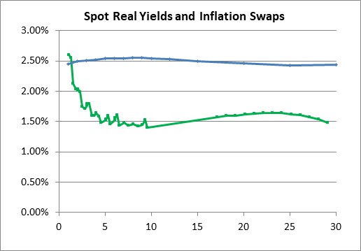
We obviously look deeper than that, though, on this channel. We can separate nominal yields into real yields (represented by TIPS) and inflation compensation (breakevens, or inflation swaps). Here are what the curves look like today (source: Enduring Investments).
From here, it looks fairly obvious that a good deal of the steepening should come from longer-term real rates rising. The 2y TIPS bond is at roughly 2%, so 2s-10s in reals is about the same as it is in nominals. The inflation curve is ridiculously flat. I do think that the inflation curve is more likely to shift higher in parallel than to steepen; a steepening inflation curve would imply accelerating inflation going forward and I don’t think investors really believe we’ll get acceleration. So I think that the movement in the shape of the TIPS curve will be very similar to the movement in the nominal curve, but with the level of the nominal curve being driven by an upward parallel-ish shift in the inflation curve.
| 2y | 10y | |
| Current TIPS Yields | 1.96% | 1.42% |
| EOY TIPS Yields | 1.80% | 1.85% |
| Current Breakevens | 2.30% | 2.27% |
| EOY Breakevens | 2.45% | 2.65% |
VOLATILITY
Generally speaking, a higher-inflation environment is a higher-volatility environment. The chart below (source: Bloomberg) shows core CPI in blue against the ICE BofA MOVE Index of fixed-income option volatility. True to form, the higher-inflation regime has correlated with higher levels of fixed-income volatility.
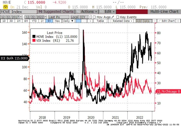
It isn’t terribly shocking that volatility is higher in bonds than it had been during the years when interest rates were fixed within a stone’s throw of zero. And it shouldn’t be terribly shocking that I expect volatility to stay somewhat higher than the 2017-2019 and 2020-early 2021 levels, even as core inflation recedes somewhat. What may be surprising is the observation that a sizeable gap has opened up in the behavior of fixed-income volatility and equity volatility, as the following chart comparing the VIX (equity vol) and MOVE (fixed-income vol) shows. Note that these are different axes, but you can clearly see the uptrend in the MOVE that has not been replicated by the VIX.
I mentioned earlier how regular and controlled the decline in the stock market has been, and how this has allowed the Fed to push rates further than anyone thought they would, a year ago. There have not been too many periods where option sellers have been punished for being short vol in equities. On the other hand, bond vol has been very different now from what it was a few years ago. In short, there has been a regime change in bond vol, but not in equity vol. At some level, this will continue, but the spread should narrow as the Fed gets to the end of the tightening regime. I think we will end 2023 with the VIX above 22 log vol – where it is today or slightly higher – but with the MOVE around 90 norm vol.
Both of those figures represent more-volatile conditions than we have seen for some years pre-COVID.
EQUITIES
It hurts to say, but equities are still far, far, far overvalued.
For many years, there has been a running tension between people who use the “Fed model” as a way to justify the current level of the stock market and the people who point out that the “Fed model” does not imply that the current level of the market is fair. The “Fed model” essentially says that when interest rates are very low, the present value of future cash flows is higher; ergo, the equilibrium value of the average equity (whose fair value is dependent on the present value of future earnings) and hence the overall stock market is higher, when interest rates are lower. This is analytically true. However, it does not mean that your expectation of future returns, when P/E multiples are at 40 but interest rates are low, should be the same as your expectation when P/E multiples are at 15 but interest rates are high. The level of interest rates explains higher equity prices, but it does not imply that those are now long-term fair value levels.
But this tension was almost always resolved in favor of the people who thought that rock-bottom interest rates meant that stocks should be at sky-high multiples, and value investors were left in the dust for more than a decade.
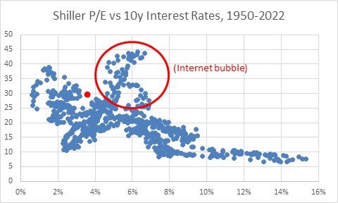
Unfortunately, this tension is being reduced because interest rates are going higher, and may never go back to those levels again. Consequently, equity price/earnings multiples need to re-rate for the new level of interest rates. The same logic that was used to justify the stock market at a 35 Shiller P/E, reconciles to lower prices now and going forward. The chart below (source: Robert J Shiller, updated with Enduring Investments calculations) shows the Shiller P/E (aka Cyclically-Adjusted P/E Ratio, or CAPE) versus 10-year interest rates in the post-WWII period. There is, ex-Internet bubble, a pretty clear relationship between interest rates and valuations. The red dot is where current multiples and interest rates are.
My forecast of 4.5% 10-year Treasuries implies something like a 23 Shiller P/E, down from 30 now. Without earnings growth, that 23% decline in the multiple implies a 23% decline in the stock market from these levels. I don’t think earnings themselves will increase or decrease very much unless the recession is much worse than I think it’s going to be, but the same lag between wages and product prices that flattered earnings when inflation was heading higher will detract when inflation decelerates. Moreover, if I’m right that Powell is intentionally steering interest rates to a level that is consistent with a long-term equilibrium around 4%-4.5% then this 23% adjustment in prices will not necessarily be followed by another massive bull market the likes of which we became accustomed to during the long bond bull market of the last 40 years. A Shiller P/E in the low-20s is still fairly generous historically but it may be sustainable.
So, my point forecast is for the S&P to get to 3,000 sometime in 2023. I don’t think the current bear market will last the entire year, and in fact I am sure there will be a rollicking rally when it is clear the Fed is done tightening. But sticky inflation will hurt here, too, and after that rollicking rally I think we’ll have another low, and from that low is where a modest bull market will begin.
However, I should also note that 1-year equity vol is around 25%, so my projection is within 1 standard deviation of unchanged!
COMMODITIES
From 1999 through 2008, commodities were in a bull market. After a brutal crash in the Global Financial Crisis, commodity indices had another mini-bull market from 2009-2011 before enduring a 9-year bear market. Since March 2020, the massive increase in the quantity of money has driven down the value of money relative to commodities or, to put it in the normal way, has driven up the price of commodities.
The Bloomberg Commodity Index (spot) rose from 59 in March 2020 to 124 in March 2022, and has come off the boil a bit since then. At the highs, though, the level of the index was only back to the levels of 2014. This is normal with spot commodities, which thanks to improved production and extraction technology over time tend to be perpetually deflating in real terms.[4] The good news is that an investor in commodities does not generally buy spot commodities but rather invests through collateralized futures contracts or invests in an index based on collateralized futures contracts. Over time, the collateral return happens to be a very important source of return (in addition to spot returns, the return from normal backwardation, and the volatility/rebalancing return), and this year there is terrific news in that collateral returns are ~4% higher than they were before the Fed started to hike. This means that, all else equal, commodities index returns should be expected to be 4% better (in nominal terms) this year than over the last couple of years. All else is not equal, but I expect gains in investible commodities indices in 2023.
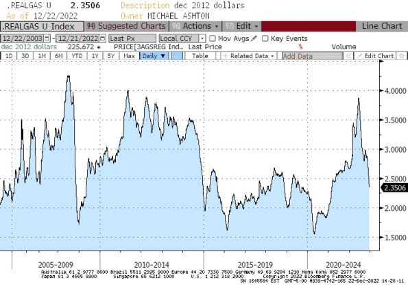
That’s entirely separate from the question of whether we are in a commodity supercycle, due to chronic underinvestment in exploration and extraction technologies and more difficult geopolitical pressures that increase the costs of mining, growing (e.g. because of fertilizer costs/shortages), and transporting the raw commodities. I think the answer there appears to be ‘yes,’ which means that in general I want to play the commodity market from the long side more than from the short side. Of course there will be brutal moves in both directions, and bears will really want to sell commodities as the recession comes to the fore. But most of that is already in the price, with gasoline at levels much closer to the GFC lows than to anything approximating the highs. The chart below shows retail gasoline prices, adjusted for inflation (using 2012 dollars).
Energy prices of course could fall further, but considering that part of the reason prices have fallen this far is that the Strategic Petroleum Reserve has been flushing oil into the system (and that has ended, in theory) and China’s economy has been sputtering under Zero Covid (which has also ended, in theory), it is hard to think that is the better direction at the moment.
OTHER THINGS
I want to append one very important admonition for investors and investment advisors. I mention this frequently on podcasts, TV and radio appearances, at cocktail parties and to random strangers on mass transit:
The next decade will be very unlike the decades we have just experienced. Not only will inflation and interest rates be higher than we’ve become accustomed to, and markets more volatile, but some important drivers of portfolio construction will shift. The good news is that at least some of those shifts are systematic and predictable. The table below shows how 60/40 returns correlate with inflation, with inflation expectations, and with inflation surprise over two periods. The first period was the 30 years ending in 2004, when inflation averaged 4.89% and was three times as volatile as during the subsequent period. During that period, a 60-40 portfolio was significantly exposed to inflation. The more-recent period, during which inflation was low and stable, produced placid 60/40 returns and correlations with inflation that are mostly spurious because there was more noise than signal. Inflation didn’t move!
The first implication of this is that portfolios which have productively ignored inflation-fighting elements over the last two decades need them now, because the main asset classes used in portfolio construction are terribly inflation-exposed. All portfolios for investors who do not have sufficient ‘natural’ inflation hedges should include such assets as commodities and an allocation to inflation-linked bonds in lieu of some of the nominal bond allocation.
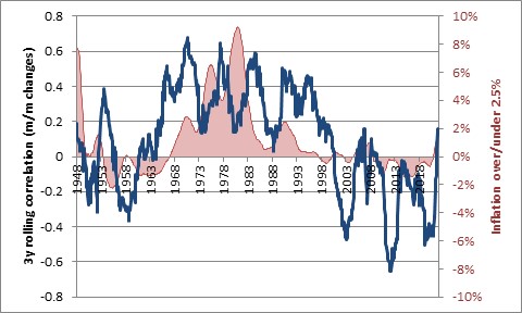
The second implication is related but less conspicuous. The entire correlation matrix is shifting away from what it has been over the last couple of decades, and back to something that incorporates the inflation factor that has been dormant. As the most obvious example, stocks and bonds which have been inversely correlated for a while, due to the fact that they respond differently to economic growth, are becoming correlated again. This is not an aberration but entirely normal for regimes in which inflation is not low and stable. The chart below illustrates this. When 3-year average inflation is above 3% (the red shaded area), then 3-year correlations of stocks and bonds tend to be positive (blue line). When inflation is below that level, correlations tend to be negative.
Negative correlations between stocks and bonds are great because they lower portfolio risk. But in the coming decade, 60/40 won’t be as low risk as it has been. But beyond that, the entire covariance matrix that an advisor relies on to simulate and optimize portfolios needs to be examined. The normal way is to use recent returns (say, the last 10 years) to generate this covariance matrix, which then is used to find the mean/variance-optimized portfolio for a given level of risk. That’s normally okay, but as inflation proves sticky that sort of covariance matrix will be wrong, and wrong in a systematic way. What I am doing for our customers is comparing portfolios optimized with a recent covariance matrix to portfolios optimized using a covariance matrix from the 1980s-1990s. It’s important to be aware of this potential problem in portfolio construction, and to get ahead of it.
Finally, let me take a moment to thank the readers of this blog for their interest in it. I write partly because the discipline of arguing my points out thoroughly makes me (I think) a better trader and investor, but I also garner a lot of value from the information and ideas I receive reciprocally from readers who agree or disagree with what I write. I appreciate this feedback very much, and I thank the readers who take the time to share their opinions with me.
Aside from the personally selfish reason I have for writing, there is also the corporate mission the blog is meant to accomplish, and that is to raise the profile of Enduring Investments and the Inflation Guy franchise with prospective clients, and to encourage them to do business with us. If prospective clients see value in these musings, then I hope they will choose to do business with us. Yes, that’s crassly commercial. But ‘tis the season! And if you read this far in this missive, please consider what that means about the value you’re getting, and how much more value you might get from a deeper relationship with Enduring Investments!
And if not, Merry Christmas anyway! Happy holidays and Happy New Year.
– Mike ‘The Inflation Guy’ Ashton
DISCLOSURE – My company and/or funds and accounts we manage have positions in inflation-indexed bonds and various commodity and financial futures products and ETFs related to them that are discussed in this column.
[1] It bears noting, though, that until 1982 the shelter component of CPI was tied to mortgage rates and home prices and not rents, so that the early-80s rise in core CPI partly reflected the Volcker rate hikes. Fixing that problem was what released the conspiracy nuts who plague us to this day claiming that the BLS “manipulated” CPI downward.
[2] https://fiscaldata.treasury.gov/americas-finance-guide/national-deficit/
[3] Net interest was about $110bln less, since some of that interest is paid to other parts of the government, for example the Federal Reserve system. For now.
[4] I wrote a nice, short little piece called “Corn Prices – Has the Correction Run its Course?” that is worth reading if you are interested in commodities.
Are Home Prices Too High?
There is an advantage to squatting in the same niche of the market for years, even decades. And that is that your brain will sometimes make connections on its own – connections that would not have occurred to your conscious mind, even if you were studying a particular question in what you thought was depth.
A case in point: yesterday I was re-writing an old piece I had on the value of real estate as a hedge, to make it a permanent page on my blog and a “How-To” on the Inflation Guy app. At one point, I’m illustrating how a homeowner might look at the “breakeven inflation” of homeownership, and my brain asked “I wonder how this has changed over time?”
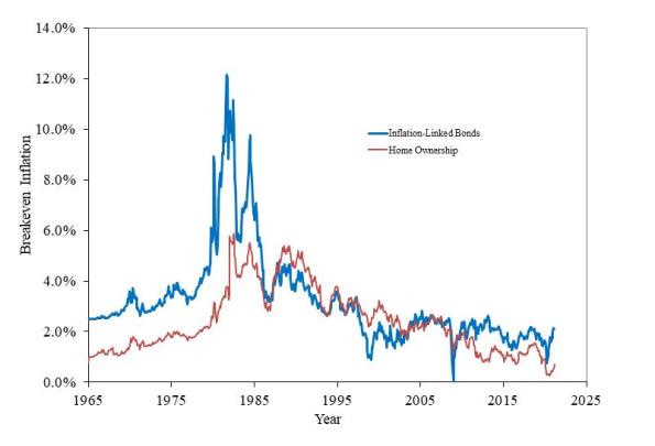
So, I went back in the Shiller dataset and I calculated it. To save you time reading the other article, the basic notion is that a homeowner breaks even when the value of the home rises enough to cover the after-tax cost of interest, property taxes, and insurance. In what follows, I ignore taxes and insurance because those vary tremendously by locality, while interest does not. But you can assume that the “breakeven inflation” line for housing ought to be at least a little higher. In the chart below, I calculate the breakeven inflation assuming that mortgage rates are roughly equal to the long Treasury rate (which isn’t an awful assumption if there’s some upward slope to the yield curve, since the duration of a 30-year mortgage is a lot less than the duration of a 30-year Treasury), that a homeowner finances 80% of the purchase, pays taxes at the top marginal rate, and can fully deduct the amount of mortgage interest. I have a time series of the top marginal rate, but don’t have a good series for “normal down payment,” so this illustration could be more accurate if someone had those data. The series for inflation-linked bonds is the Enduring Investments imputed real yield series prior to 1997 (discussed in more detail here, but better and more realistic than other real yield research series). Here then are the breakeven inflation rates for bonds and homes.
It makes perfect sense that these should look similar. In both cases, the long bond rate plays an important role, because in both cases you are “borrowing” at the fixed rate to invest in something inflation-sensitive.
The intuition behind the relationship between the two lines makes sense as well. Prior to the administration of Ronald Wilson Reagan, the top income tax rate was 70% or above. Consequently, the value of the tax sheltering aspect of the mortgage interest made it much easier to break even on the housing investment than to invest in inflation bonds (had they existed). That’s why the red line is so much lower than the blue line, prior to 1982 (when the top marginal rate was cut to 50%) and why the lines converged further in 1986 or so (the top marginal rate dropped to 39% in 1987). The red line even moves above the blue line, indicating that it was becoming harder to break even owning a home, when the top rate dropped to 28%-31% for 1988-1992. Pretty cool, huh?
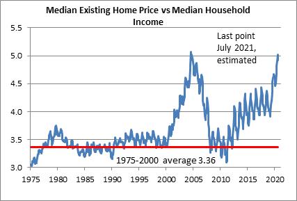
Now, this just looks at the amount of (housing) inflation of the purchase price of the home needed to break even. But the probability of realizing that level of housing inflation depends, of course, on (a) the overall level of inflation itself and (b) the level of home prices relative to some notion of fair value. This is similar to the way we look at probable equity returns: what earnings or dividends do we expect to receive (which is related to nominal economic growth), and what is the starting valuation level of equities (since we expect multiples to mean-revert over time). That brings me back to a chart that I have previously found disturbing, and that’s the relationship between median household income and median home prices. For decades, the median home price was about 3.4x median household income. Leading up to the housing bubble, that ballooned to over 5x…and we are back to about 5x now.
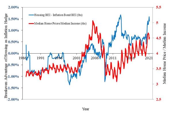
That’s the second part of the question, then – what is the starting valuation of housing? The answer right now is, it’s quite high. So are we in another housing bubble? To answer that, let’s compare the two pictures here. In the key chart below, the red line is the home price/income line from the chart above (and plotted on the right scale) while the blue line is the difference between the breakeven inflation for housing versus breakeven inflation in the bond market.
In 2006, the breakeven values were similar but home prices were very high, which means that you were better off taking the bird-in-the-hand of inflation bonds and not buying a home at those high prices. But today, the question is much more mixed. Yes, you are paying a high price for a home today; however, you also don’t need much inflation to break even. If home prices rise 1.5% less than general inflation, you will be indifferent between owning real estate and owning an inflation bond. Which means that, unlike in 2006-7, you aren’t betting on home prices continue to outpace inflation. It’s a closer call.
I can come up with a more quantitative answer than this, but my gut feeling is that home prices are somewhat rich, but not nearly as much so as in 2006-07, and not as rich as I had previously assumed. Moreover, while a home buyer today is clearly exposed to an increase in interest rates (which doesn’t affect the cash flow of the owner, but affects the value the home has to a future buyer), a home buyer will benefit from additional “tax shelter value” if income tax rates rise (as long as mortgage interest remains tax deductible!). And folks, I don’t know if taxes are going up, but that’s the direction I’d place my bets.
CPI Forwards Show Inflation Concerns Aren’t Ebbing
One of the most important things I learned as a markets person was the relationship between “spot” prices and “forward” prices. A spot price is the price today, if you buy a particular investment or commodity. A forward price is the price that you agree today to pay in the future on some date for delivery of that investment/item.
To a non-markets person, this seems odd. If I want to buy a carton of milk, but the grocery store is out of milk so I tell the grocer “hold one of those cartons for me when they come in,” it wouldn’t occur to me that I should pay a different price than is on the shelf. Or, maybe, I might expect to pay whatever the price is, when the milk comes in. But I wouldn’t think that today I should arrange for a different price for that milk just because I get it in the future.
But of course, the idea of the present value of money is super important in investing. A dollar received in the future is worth less than a dollar received today. (That is, unless interest rates are negative. In that case, a dollar in the future is weirdly worth more than a dollar today, and we are in that bizarre situation I described once, in a really neat post, as ‘Wimpy’s World.’) But it isn’t just money that has a different value for future delivery than it does today. There are at least two ways that I can own a pound of gold six months from now. One is to buy a pound of gold, and pay for storage and for insurance for six months. The other is to arrange with someone today to deliver me a pound of gold in six months. In that case, I don’t have to pay for storage and insurance, so I’ll be willing to pay more for gold in the future. In commodities markets, we say that this curve is in “contango,” where futures prices are above spot prices.
The important thing to realize, though, is that all of these things converge. The spot price of gold will eventually converge to the 6-month forward price of gold…in, as it happens, about six months. If there is no change in the price of insurance and storage, every day the spread of the futures price over the spot price will decline by one day’s worth of those expenses. (n.b. – there are other parts of the carry, too; I’m abstracting here for illustration). If nothing else in the market changes, then the spot price will gradually rise towards that forward price. Here is the important bit that markets people learn: in some sense, that is not a true profit:
Buy today: $1700 plus $10 storage plus $10 insurance = $1720 cost of gold 6 months’ forward
Buy for forward delivery: $1720.
In both cases, if I sell the gold six months and one day from now at $1720, I have made zero money, even though in the first case I paid $1700 for it. But it looks like gold rallied.
I’m not really here to talk about gold. I’m here to talk about economists.
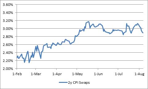
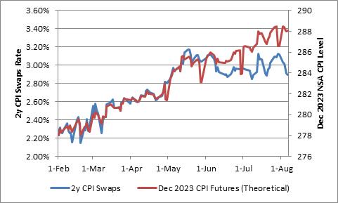
Economists don’t really internalize this well. Case in point is the question about whether inflation expectations are ‘anchored.’ An economist – in particular, a Fed economist – looks at the following chart of 2-year inflation swaps since February and says “Expectations for inflation two years in the future rose between February and May, and then have been flat-to-down since then.”
But that’s not really what happened.
Someone who bought inflation swaps in early May got something that a buyer of inflation swaps today doesn’t get. The May 15th version of inflation swaps, because of the way they work with a 3-month lookback, got half of the 0.6% March CPI print, plus the 0.8% April print, the 0.6% May print, and the 0.9% June print. The person who buys inflation swaps today doesn’t get March and April, and only half of the May uptick (plus June). Ergo, if nothing else changes we would expect the price for a 2-year inflation swap today to be lower than the price in mid-May.
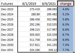
As the high prints from the last few months pass into the rear view mirror (although there will be some high ones to come, I don’t really expect +0.9% m/m any time soon), the inflation swaps and breakevens markets should look softer. It’s just carry. But how much softer?
One way to find out what is really happening to inflation expectations is to look at the forwards. Let’s pretend for a minute that the CME had actually launched CPI futures a few years ago, and we had a CPI futures contract that traded in December 2023 (settling to the November CPI print that comes out that month). Over the last few months, what would have happened to the price of that futures contract? The chart below shows that it would have enjoyed a very steady rise over the last six months. The CPI futures contract settles (or anyway, it would have) to a particular price level. We would almost always expect the futures prices to be above the current NSA CPI number, which was 271.696 in June. But these prices – which I’ve calculated from an inflation swaps curve I build every day – are showing that investors have responded to these higher CPI prints by steadily raising their expectation of future prices.
If investors thought these last few months were going to be reversed in the coming months, then the forwards wouldn’t have responded in this way. Investors would be betting that the high prints would be followed by low prints that reverse the changes. However, that’s not what is happening. Investors are taking these high prints and putting them in the bank. While they might think the rise in the inflation rate is transitory, they don’t think the rise in the price level is transitory.
This is a key distinction. The inflation we are seeing, even if it later slackens, represents a permanent loss of purchasing power. How much of a permanent loss have we seen in the last couple of years? Here are my calculations of the theoretical futures curve for CPI, as of August 1st, 2019 compared to last Friday. The last column shows how much higher investors think prices will be on those dates today, compared to what they thought two years ago.
Notice that this is from well before the crisis, and so takes into account the plunge in prices from early 2020 and the recent increases. After all of the zigzags, investors expect prices to be about 5% higher in 2023 than they would have thought previously, and about 8% higher in 10 years.
And I think they’re too sanguine.
Some Thoughts on Gold, Real Yields, and Inflation
TIPS-style inflation-linked bonds (more properly known as Canadian-style) pay a fixed coupon on a principal amount that varies with the price level. In this way, the real value of the principal is protected (you always get back an amount of principal that’s indexed to the price level, floored in the case of TIPS at the original nominal value), and the real value of the coupon is protected since a constant percentage of a principal that is varying with the price level is also varying with the price level. This clever construction means that “inflation-linked” bonds can be thought of as simply bonds that pay fixed amounts in real space.
I have illustrated this in the past with a picture of a hypothetical “cake bond,” which pays in units of pastry. The coupons are all constant-sized cupcakes (although the dollar value of those cupcakes will change over time), and you get a known-sized cake at the end (although the dollar value of that cake might be a lot higher). That’s exactly what a TIPS bond is essentially accomplishing, although instead of cupcakes you get a coupon called money, which you can exchange for a cupcake. This is a useful characteristic of money, that it can be exchanged for cupcakes.

The beauty of this construction is that these real values can be discounted using real yields, and all of the usual bond mathematics work just perfectly without having to assume any particular inflation rate. So you can always find the nominal price of a TIPS bond if you know the real price…but you don’t need the nominal price or a nominal yield to calculate its real value. In real space, it’s fully specified. The only thing which changes the real price of a real bond is the real yield.
All TIPS have coupons. Many of them have quite small coupons, just like Treasuries, but they all have coupons. So in the cake bond, they’re paying very small constant cupcakes, but still a stream of cupcakes. What if, though, the coupon was zero? Then you’d simply have a promise that at some future date, you’d get a certain amount of cake (or, equivalently, enough money to buy that certain amount of cake).

Of course, it doesn’t have to be cake. It can be anything whose price over a long period of time varies more or less in line with the price level. Such as, for example, gold. Over a very long period of time, the price of gold is pretty convincingly linked to the price level, and since there is miniscule variation in the industrial demand for gold or the production of new gold in response to price – it turns out to look very much like a long-duration zero-coupon real bond.
And that, mathematically, is where we start to run into problems with a zero-coupon perpetuity, especially with yields around zero.
[If you’re not a bond geek you might want to skip this section.] The definition of Macaulay duration is the present-value-weighted average time periods to maturity. But if there is only one “payment,” and it is received “never,” then the Macaulay duration is the uncomfortable ∞. That’s not particularly helpful. Nor is the mathematical definition of Modified duration, which is Macaulay Duration / (1+r), since we have infinity in the numerator. Note to self: a TIPS’ modified duration at a very low coupon and a negative real yield can actually be longer than the Macaulay duration, and in fact in theory can be longer than the maturity of the bond. Mind blown. Anyway, this is why the concept of ‘value’ in commodities is elusive. With no cash flows, what is present value? How do you discount corn? Yield means something different in agriculture…
This means that we are more or less stuck evaluating the empirical duration of gold, but without a real strong mathematical intuition. But what we think we know is that gold acts like a real bond (a zero coupon TIPS bond that pays in units of gold), which means that the real price of gold ought to be closely related to real yields. And, in fact, we find this to be true. The chart below relates the real price of gold versus the level of 10-year real yields since TIPS were issued in 1997. The gold price is deflated by the CPI relative to the current CPI (so that the current price is the current price, and former prices seem higher than they were in nominal space).
When we run this as a regression, we get a coefficient that suggests a 1% change in real yields produces a 16.6% change in the real price of gold (a higher yield leads to a lower gold price), with a strong r-squared of 0.82. This is consistent with our intuition that gold should act as a fairly long-duration TIPS bond. Of course, this regression only covers a period of low inflation generally; when we do the same thing for different regimes we find that the real gold price is not quite as well-behaved – after all, consider that real gold prices were very high in the early 1980s, along with real yields. If gold is a real bond, then this doesn’t make a lot of sense; it implies the real yield of gold was very low at the same time that real yields of dollars were very high.
Although perhaps that isn’t as nonsensical as it seems. For, back in 1980, inflation-linked bonds didn’t exist and it may be that gold traded at a large premium because it was one of the few ways to get protection against price level changes. Would it be so surprising in that environment for gold to trade at a very low “gold real yield” when the alternative wasn’t investible? It turns out that during the period up until 1997, the real price of gold was also positively related to the trailing inflation rate. That sounds like it makes sense, but it really doesn’t. We are already deflating the price of gold by inflation – why would a bond that is already immunized (in theory) against price level changes also respond to inflation? It shouldn’t.
And yet, that too is less nonsensical as it seems. We see a similar effect in TIPS today. Big inflation numbers shouldn’t move TIPS higher; rather, they should move nominal bonds lower. TIPS are immunized against inflation! And yet, TIPS most definitely respond when the CPI prints surprise.
(This is a type of money illusion, by which I mean that we are all trained to think in nominal space and not real space. So we think of higher inflation leading to TIPS paying out “more money”, which means they should be worth more, right? Except that the additional amount of dollars they are paying out is exactly offset by the decline in the value of the unit of payment. So inflation does nothing to the real return of TIPS. Meanwhile, your fixed payment in nominal bonds is worth less, since the unit of payment is declining in value. Although this is obviously so, this ‘error’ and others like it – e.g. Modigliani’s insistence that equity multiples should not vary with inflation since they are paying a stream of real income – have been documented for a half century.)
For now, then, we can think of gold as having a very large real duration, along with a price-level duration of roughly one (that is just saying that the concept of a real price of gold is meaningful). Which means that higher inflation is actually potentially dangerous for gold, given low current real yields, if inflation causes yields (including real yields) to rise, and also means that gold bugs should cheer along with stock market bulls for yield curve control in that circumstance. Inflation indeed makes strange bedfellows.
Summary of My Post-CPI Tweets (August 2020)
Below is a summary of my post-CPI tweets. You can (and should!) follow me @inflation_guy. Or, sign up for email updates to my occasional articles here. Investors, issuers and risk managers with interests in this area be sure to stop by Enduring Investments!
- Well, it’s CPI day and I have to tell you I’m looking forward to this one and I’ll tell you why.
- Used cars! The Black Book retention index jumped about 9% last month after 8.5% the prior month. There’s typically a 3-month lag before it gets into CPI, but w/ a big move it’s harder to say. Each of those jumps would be worth about 0.3% on core, and we have two of them coming.
- That being said, (a) there is still one dip we haven’t seen yet so we COULD have a dip in used cars this month. It would be surprising, but it would mean we can prep for a couple of really good numbers. So I’m excited either way.
- And it’s not just used cars. Now that things are opening up, we’re going to see pressures in other places. Medical care started to show some ups last month and I expect that to continue as hospitals are hurting for revenue.
- Last month we also saw strong apparel, lodging away from home, and airfares, which were rebounding from the covid-induced swoon. I think that could continue, and it’s an interesting story line to watch.
- On the other hand – this is next month’s story but college tuitions are likely to decline this year because colleges are giving discounts. Even though the product has changed in quality (e-learning not the same as in-person), the BLS has decided it can’t quality-adjust easily.
- So CPI for college-tuition-and-fees – again, probably next month – will fall and then rebound hard next year. So that’s fun. It’s not right, but it’s okay, as the saying goes.
- Shelter last month, ex-hotels, was soft. That’s the only fly in the inflationary ointment, but it’s a big one. So far it doesn’t look like rents are likely to decelerate much overall, nor housing prices fall – but if they do, that’s a big deal.
- I will be looking at core-ex-housing to see if pressures are broadening, but looking at shelter b/c it’s a big, slow item. If shelter weakens appreciably, it will be news – historically, with the last recession being an exception, housing prices and rents almost never FALL.
- But they can slow, and with incomes sketchy housing inflation probably SHOULD slow. If it doesn’t, that’s a real sign that the rising monetary tide is raising all assets. (And goods and services). FWIW, wages also aren’t slowing. Atlanta Fed wages are +3.8% y/y.
- (There’s interesting stuff around the disconnect between wages and the unemployment rate right now, but I’ll save that for a blog post another time. Not really a CPI-day thing.)
- Consensus today is for 0.2% on core CPI, but a soft 0.2% with y/y falling to 1.1%. I think there’s lots of upside to that if Used Cars pops, but a little downside if shelter is weak again. I’m in the “probably higher” camp.
- Good luck! And if you’re curious about what an inflation guy does when it’s not CPI day, stop by Enduring Investments: http://enduringinvestments.com
- Oh, yes.
- I don’t think we need to worry much about the rounding this month. Core +0.6% m/m; y/y to 1.6% when it was expected to drop to 1.1%.
- FWIW, that was rounded down. +0.62% m/m on core. Repeat: rounded down. I will have to check but that is the biggest monthly figure in decades.
- I think I soiled myself.
- There are going to be a lot of crazy charts like this one this month. This is the last 12 core CPI prints.
- y/y core rose from 1.19% to 1.57%, in one month. Core goods were -1.10% y/y; now they are -0.5%. Core services were 1.90%; now they’re 2.3%.
- Take that Keynesians. WHERE’S YOUR OUTPUT GAP MODEL NOW? …but I shouldn’t celebrate. All of those degrees…and poor Nomura forecasting outright deflation…
- Now interestingly, Used Cars and Trucks was up, 2.33% m/m, but that’s not the big jump yet. (!)
- Lodging Away from Home, another COVID-casualty, was +1.2% m/m. Same as last month. But the y/y is still -13.26% (was -13.92%).
- Primary rents rebounded some, +0.19% vs +0.12% last month, and OER as well +0.21% from +0.09%. Those are m/m numbers, and the y/y are still softening though: 3.12% for primary rents and 2.80% for OER, down from 3.22%/2.84%. But not collapsing.
- OK, I said I was going to be interested in core-ex-housing. It jumped from 0.35% y/y to +1.01% y/y. Now, that’s only the highest since March but again: the deflation dragon, if not slain, is pretty sick.
- Apparel was +1.08% m/m, but y/y is still -6.4% (was -7.2%). Like the other belly-flop categories, there’s still a lot of recovery to come.
- So how are the doctors doing? Medical Care was +0.41% m/m, but that actually dropped the y/y slightly to 5.02% from 5.08%. However, that’s mostly because Pharma remains weak.
- CPI for Medicinal Drugs was flat again. +0.02% this month; -0.01% last month. The y/y is down to 1.1%.
- But Physicians’ Services up to 2.58% y/y (up 0.67% this month)
- And hospital services hanging out at around 5% y/y. Look, like many services these are all becoming more labor-intensive and that means…more expensive. Some of that might come back, some day.
- Totally forgot airfares: +5.4% m/m after +2.6% m/m last month. But still down a lot from the peak. Here’s the y/y figure.
- And a quick check of the markets: 10-year breakevens +3.5bps, kinda surprised it’s not more. 5y breakevens +5bps. Some of this might just be time for price discovery. I know when I was a CPI swaps dealer, it took some time before we knew wth was the right price.
- BTW that core increase was the biggest monthly increase since 1991. That predates TIPS by 6 years.
- Now, college tuition and fees rose to 2.09% y/y from 1.74% y/y. That’s interesting, as that serious ought to be declining next month. And for tuitions, that’s a largeish m/m change. Interesting.
- Let’s see. Biggest m/m declines: misc personal goods (-41.7% annualized) and meats, poultry, fish & eggs (-36.9%, but it had been up a lot too).
- The list of gains annualizing more than 10% has 14 categories. Includes motor vehicle insurance, car/truck rental, public transportation, used cars/trucks, communication, jewelry, footwear, lodging away from home…
- Now, those who live by Median CPI ought to also die by Median CPI. I’ll convert you all, eventually. Median this month will be something like +0.21%, because it ignores the upside long tails like it did the downside ones. y/y will actually decline to 2.56%
- The message there is just that the underlying trends are pretty stable. But it’s not insignificant that the tails shifted to the right side from the left side. As I’ve said before, that’s sort of what infl looks like in practice, just as disinflation has one-offs to the left.
- Health insurance y/y is a little softer, down to 18.7% y/y from 19.4%. So we got that going for us.
- This is the distribution of y/y changes in the CPI. There’s still a big left tail anchor which is why core is below median. But this is a much more balanced distribution than it has been in a while.
- And here’s the weight of categories going up by more than 2.5% y/y. The weight is the highest since July 2008.
- That doesn’t look very deflationary to me.
- Putting together the four-pieces charts and then I’ll wrap up.
- Piece 1 – food and energy. With all of the wild swings, it’s net-net kinda boring.
- Piece 2, core goods. This was the piece that was getting a wind behind it because of trade frictions when the crisis hit. Big bounce this month. Much of that is autos, but as I pointed out early: the BIG jump in car prices hasn’t hit the data yet.
- Piece 3, core services less rent of shelter. Also a big recovery, and some of this is airfares. Some also is medical care. But there are a number of other categories contributing here. Still kind of trendless last 5y, overall.
- Piece 4, the biggest and slowest piece, and looks scary. Until you remember this includes hotels (lodging away from home). If you take that out, shelter has decelerated some but not a lot, and certainly not in a disturbing way like this appears. Don’t project this!
- OK to sum up. I saw someone call this a “noisy” report. Well, only in the sense of clanging cymbals. The data here all swung in one direction – but there really weren’t a lot of surprises, per se. The only surprise was the synchony of the surprises to one side.
- As I said up top, we still have a couple of +0.3% boosts (maybe +0.2% if we’re ahead of mode) coming from used cars. And a lot of the beaten-down categories haven’t really recovered (apparel, etc) fully.
- THAT’S what’s surprising. This wasn’t the left tail snapping back, much. This was a much broader advance than the decline had been. The decline had been 4 categories: lodging AFH, used cars, airfares, apparel. Way more here.
- There are lots of bumps ahead, including the question of whether home prices and rents decelerate when and if incomes decline. We aren’t seeing that yet. And with M2 growing at 23% per year, it’s hard to believe asset prices can decline very much. Including housing.
- The fun thing to think about is: what is happening at the Fed today? Are they clapping wildly, that they succeeded in pushing prices up? Or are they somber, wondering if they might have overdone it? Or are they focusing on median CPI and saying, meh?
- My guess is that there’s a bit of nervousness. The Fed wants to overshoot 2%, but they don’t want to put it at 6%. I’ve said for a long time: creating inflation is easy. Creating A LITTLE inflation is hard.
- Well, that was fun. Thanks for tuning in. I’ll put a summary on my blog relatively shortly. Again, if today’s number makes you think ‘hey, maybe we should talk to an inflation guy and see if he can help us’, stop by our website: https://enduringinvestments.com Have a nice day.
I don’t know whether to be exhausted or energized. I think I’ll go with energized, because this is not likely to be the last surprise in inflation prints. We are entering a period, not only of higher inflation (probably), but also much higher inflation volatility. That’s important, because a key underpinning of the valuation argument for stocks and bonds is that inflation is not only low, it’s low and stable and therefore can be ignored in calculations. But if inflation is volatile, and especially if it’s high and volatile, then companies and investors need to include it in their calculus. And if the inflation factor ends up becoming significant again, after more than a decade of irrelevance, then it means that (a) stocks and bonds will become increasingly correlated and (b) stock and bond valuations will be lower.
Now, I don’t know if the markets really understand what’s going on. In fact, this number was so outside of expectations I think that investors just dismissed it as a one-off, like April’s number. But it’s not. This was not just a snapback of the depressed categories; indeed, most of the categories that were depressed because of Covid (lodging away from home, airfares, e.g.) are still depressed although they’ve rebounded a little. This was much broader than that. But investors have pushed 10-year breakevens up only 3-4bps, to 1.66%. Stocks are soaring, and 10-year nominal yields are a mere 3.5bps higher. Commodities are flat. Gold, after a bloodbath yesterday, is flat today. The only way those reactions make sense is if investors are missing the significance.
When the unemployment rate shoots higher, then you can understand a positive market reaction because investors have come to count on the Fed supporting markets in that circumstance. But that reasoning doesn’t make sense here. Nothing about a 7.2% annualized rate of inflation (0.6% * 12) would make the Fed eager to add more liquidity. Ergo, it must be that investors just don’t care about the inflation numbers, or they think this is a random miss.
They should care. This isn’t a one-standard-deviation miss; it’s the biggest monthly print in thirty years and there was no big outlier. While it doesn’t guarantee that inflation is heading higher, the question is whether this print is consistent with our a priori model of the world.
If you’re a Keynesian, the answer is absolutely not. So economists who are output-gap focused are going to say that this number doesn’t matter; it’s ‘quirky’ or ‘noisy’ or ‘measurement error’; the output gap is going to drag down inflation. Maybe that’s why investors are nonchalant about this…because they’re being told by the bow-tie set to look through it.
But if you’re a monetarist, this is entirely consistent with your a priori model. The only surprising thing about this is that it is happening so soon. I was thinking we would see inflation rise starting in Q4 and it would get messy in 2021. I might have to move up the timetable. Because this number is entirely consistent with my model, I’m much less sanguine. This might be only the first shot over the bow… Indeed, over the next several months I can say that since we are confident that used car prices are going to add a lot to core inflation, we will probably have at least one or two more prints of 0.4%-0.5% on core over the next three months. If we get 0.4%, 0.2%, 0.4%, then in three months core CPI will be back to 2.25% y/y, and that with unemployment still in the high-single or low-double-digits. And it could actually be worse than that. Without home prices collapsing, it’s hard to see it being much better than that and absolutely no way to see how prices (or even the inflation rate) could be lower than that unless something really, really weird happens.
Well, 2020 is the year of really, really weird so I suppose I will never say never. But inflation hedges remain super cheap; if you’ve been waiting to scoop them up I can’t see any argument for waiting any more.
